Behind the Adrift logo
- Aug 9, 2021
- 3 min read

'Behind every great logo, there is sleep deprived logo designer'
We've had a lot of interest in the Adrift logo design and how we landed with it. Naturally, we're more than happy to talk about it in this post. With absolutely no experience, this process was an exciting journey that started with a Google image and eyebrows...
Here at Adrift we made it a top priority to launch the company with a logo that captivates the essence of the company in a minimalistic and bold way. But how do you do that? Well, it was harder than you think. For us, we had a lot of things we wanted out of the logo. Firstly, we knew that our colour palette needed to reflect the ocean which is at the core of everything we do. Nature is our canvas and that needed to be clear in the design. Impactful and rememberable logos are difficult to come by. There's a fine line between too simple and too busy, and this is something we had to learn fast.
The early stages
We started the process during lockdown which initially started with some research into two areas: Beach culture in 1970's California and different adventure apparel brands. This research quickly turned into Pinterest boards and saved lists on Instagram. We became hooked on the idea that the logo needed to feel bespoke and like it was made before digital. It needed to feel real, and a faded vintage look made that happen for us.
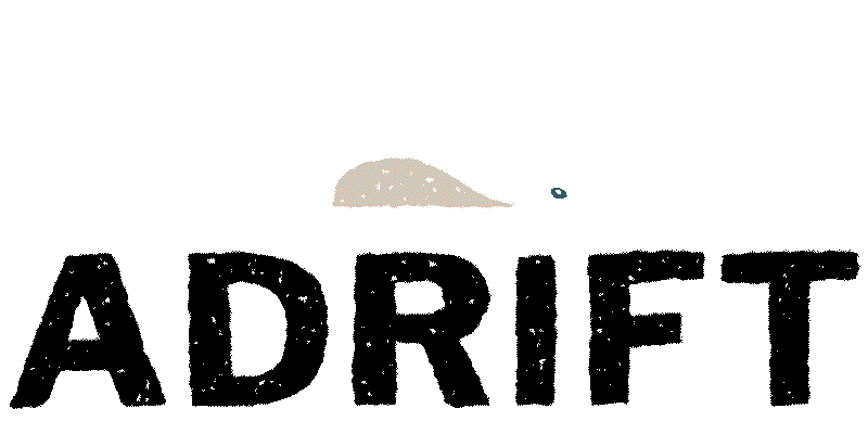
We had the idea of creating a wave with three tiers after finding an image online, which we put the three separate parts of it together - see below. We stuck the name underneath and started to pretend that this could be the logo for us (oh we're so glad we didn't end up settling with this!). These 'waves' for some people looked more like 'eyebrows' or Donalds Trump's hair... what do you see?
With all our ideas bottled up, it was time to bring in someone who could bring the logo to life and save us from the Worst Logo Award 2020.

Bring in the expert
So that's where Matt Cannon had to come in.
Matt is an adventure photographer and designer from Cornwall, who has a stunningly distinctive style and relaxing approach to his work. We were on a shoot down in Devon when we met him for the first time, and over a beer, we quickly explained, with a lot of enthusiasm, that we were really struggling with our logo.

Matt gave us a huge amount of confidence from the get go. So, after emails, zoom calls, and Alice tirelessly trying to articulate her vision, Matt nailed it first time.
Matt was able to incorporate the three tier wave in a way that firstly didn't look like eyebrows but incorporated our brand colours. We finally had a logo that portrayed the 'sand, sea, and air' version we wanted. We loved the addition of the seagull which for some people looks more the tale of a whale, which we love.
Matt created the bespoke font and shapes by hand drawing it and then digitally tracing it into the computer. The 'printed stamp' feel really added in an authentic feel which we are obsessed with. We asked Matt to create a few alternatives such as including 'Since 2020', and we now use these across our different platforms. All in all, we are very happy with the outcome.
If you want to find out more about Matt and his work visit: https://cannonmatt.com/about

.


Comments